Maplifiers
http://maplifiers.net/forum/

I tried something different this time.
http://maplifiers.net/forum/viewtopic.php?f=12&t=1130
Page 1 of 1

Author:  Snaxocaster [ Mon Jan 03, 2011 7:41 pm ]
Post subject:  I tried something different this time.

My drummer, who is responsible for the majority of our postering, has received comments that all our stuff, while well done, is too similar looking. This was intentional on my part from a branding/marketing angle. So I tried something different, keeping with the distressed industrial textures and whatnot, but not using my Garda Poster Template.
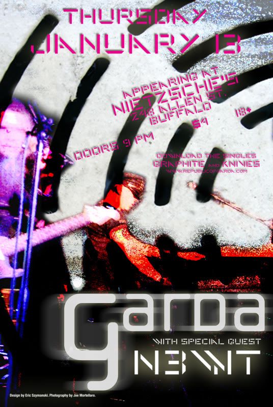
Image

Author:  chris_d [ Mon Jan 03, 2011 7:47 pm ]
Post subject:  Re: I tried something different this time.

I do dig it, but don't much like the drop shadow on the text.

I generally don't care much for dropshadow text, but at the least, i would consider spinning it 180º so that the tops of the text are crisp, and the bottoms are shadowed/blurred. Just in a general sense, as people read top to bottom, it would help with legibility, in my opinion.

Otherwise, i like the change in color and mood of it. It IMO shows more of the dance aspect of your band's style than the darker/industrial/goth end of it. :isay:

Author:  Unstrung [ Mon Jan 03, 2011 7:49 pm ]
Post subject:  Re: I tried something different this time.

It looks like you care a lot more than anyone around here. :red:


I like the pink. :eekass:

Author:  GnarlySheen [ Mon Jan 03, 2011 11:34 pm ]
Post subject:  Re: I tried something different this time.

Pretty

Author:  Snaxocaster [ Wed Jan 05, 2011 4:03 pm ]
Post subject:  Re: I tried something different this time.

chris_d wrote:
I do dig it, but don't much like the drop shadow on the text.

I generally don't care much for dropshadow text, but at the least, i would consider spinning it 180º so that the tops of the text are crisp, and the bottoms are shadowed/blurred. Just in a general sense, as people read top to bottom, it would help with legibility, in my opinion.

Otherwise, i like the change in color and mood of it. It IMO shows more of the dance aspect of your band's style than the darker/industrial/goth end of it. :isay:


Thank you sir. :isay:

It actually worked printed, if only because of the tendency of that machine to run dark. It wound up working as an outline sorta deal, so I left it.

...and yeah, it's a lot more dancey looking. Our opener does nifty live electronica, so that was more the vibe we were going for. I'm glad it works!

Unstrung wrote:
It looks like you care a lot more than anyone around here. :red:


I like the pink. :eekass:


Thank you. We get that a lot about our shows in general. Even if you're not into what we do, we make the effort.

And you would, wouldn't you. :dildo: Also, it's magenta. :red:

Page 1 of 1 All times are UTC - 5 hours [ DST ]
Powered by phpBB © 2000, 2002, 2005, 2007 phpBB Group
http://www.phpbb.com/