
Of course, if the band thinks it's totally lame, than...


| Maplifiers http://maplifiers.net/forum/ |
|
| Garda cover- buggered if I know which to go with. http://maplifiers.net/forum/viewtopic.php?f=12&t=2411 |
Page 1 of 1 |
| Author: | Snaxocaster [ Wed Apr 04, 2012 5:15 am ] |
| Post subject: | Garda cover- buggered if I know which to go with. |
| Of course, if the band thinks it's totally lame, than...
|
|
| Author: | Unstrung [ Wed Apr 04, 2012 11:41 am ] |
| Post subject: | Re: Garda cover- buggered if I know which to go with. |
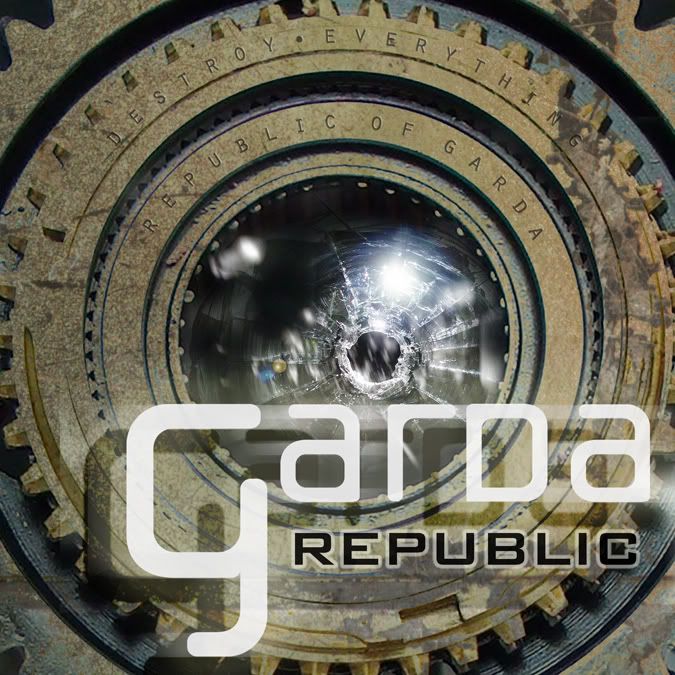
First one, let's me 'mire the gears 'n shit |
|
| Author: | Snaxocaster [ Wed Apr 04, 2012 11:48 am ] |
| Post subject: | Re: Garda cover- buggered if I know which to go with. |
...and you'll be pleased to know that is in fact Yonge Street (in proper  coloration) behind the glass, as it were. coloration) behind the glass, as it were.
|
|
| Author: | chris_d [ Wed Apr 04, 2012 12:11 pm ] |
| Post subject: | Re: Garda cover- buggered if I know which to go with. |
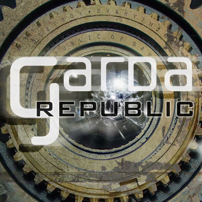
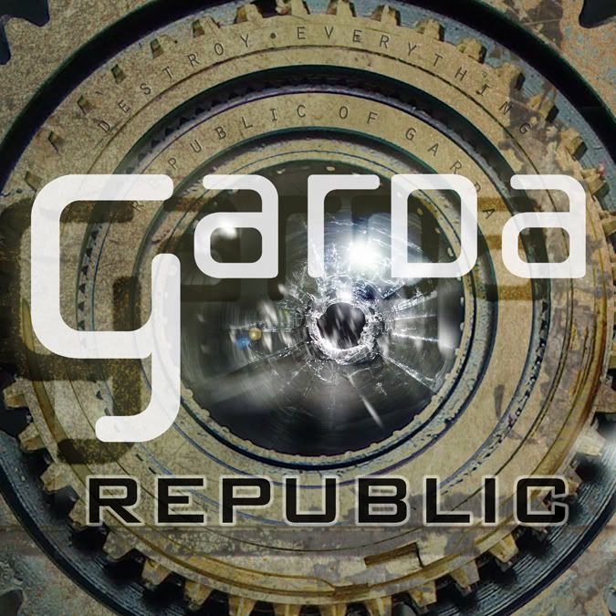
I like the first one the moast. The other ones feel a bit too symmetrical to me, vertically and horizontally. Name of the recoard "Republic"? I might scuzz up the text on the gears a bit to push them a bit further back from easy legibility, and to discourage college DJs from calling the band "garda republic" and the recoard "destroy everything". I might also go for the lighter treatment of the logo from the third one. The third one is actually also nice, though i might reduce the size of the word "REPUBLIC" onnit so it is not as close to the same width of the logo. I might be inclined to bring the width of that to a bit closer to that of the lens, maybe just a little bigger than that. Nice colors and shapes overall, i dig it. 
|
|
| Author: | Devtron [ Wed Apr 04, 2012 4:09 pm ] |
| Post subject: | Re: Garda cover- buggered if I know which to go with. |
I like the first one bestest. |
|
| Author: | torgeot [ Tue May 01, 2012 12:37 pm ] | |||||||||
| Post subject: | Re: Garda cover- buggered if I know which to go with. | |||||||||
I was thinking something along these lines |
||||||||||
| Author: | Snaxocaster [ Fri May 11, 2012 5:57 pm ] |
| Post subject: | Re: Garda cover- buggered if I know which to go with. |
Well, I wound up doing both, by suggestion of the persons in the band as well, go figure. If anyone can be arsed to look at a 60 meg PDF (hint: load this in Photoschnappes, not Acrobat/Preview/etc. if you want it to not take forever), the whole damn shooting match for the album art is here: http://dl.dropbox.com/u/13184331/GARDA_REPUBLIC_6panel_flat.pdf.zip Minus a few minor changes (there's some type missing in the credits, a couple things need to be moved, lighten the title on the spine or the art under it for legibility) and cleaning up around the flap for the CD. I left the template on so the bandpeeps could see what's where. Rotate 180º to look at the inside part. I couldn't resist being a clever bastard and having hinges- a hinge, at any rate; I might add a second at the bottom- in the art where it opens up to the CD pocket and having something resembling a handle on there too.
|
|
| Page 1 of 1 | All times are UTC - 5 hours [ DST ] |
| Powered by phpBB © 2000, 2002, 2005, 2007 phpBB Group http://www.phpbb.com/ |
|