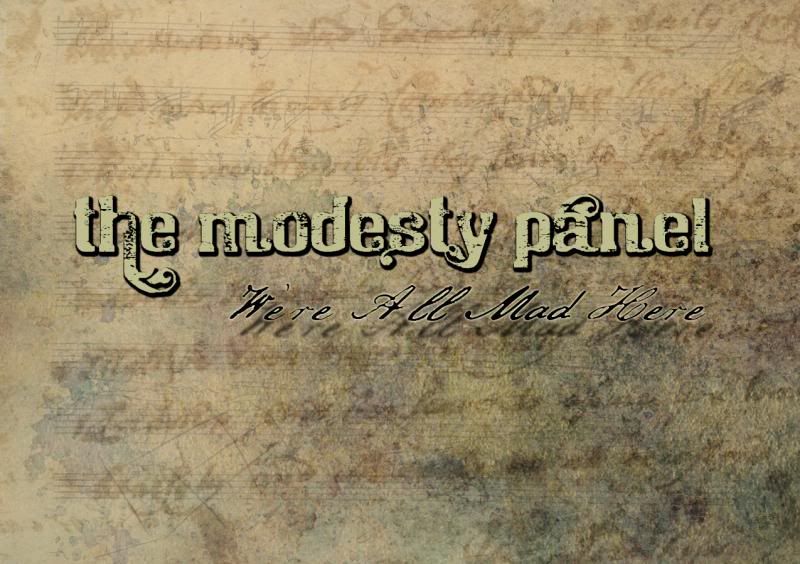
A concept in progress. I want swirly and earth tones and a somewhat dark/possibly odd Victorian thing going on artwise.
| Maplifiers http://maplifiers.net/forum/ |
|
| Solorekkid Idea Crappe. http://maplifiers.net/forum/viewtopic.php?f=12&t=2855 |
Page 1 of 1 |
| Author: | Snaxocaster [ Tue Sep 10, 2013 6:14 am ] |
| Post subject: | Solorekkid Idea Crappe. |
A concept in progress. I want swirly and earth tones and a somewhat dark/possibly odd Victorian thing going on artwise.
|
|
| Author: | Snaxocaster [ Sun Dec 08, 2013 1:41 am ] |
| Post subject: | Re: Solorekkid Idea Crappe. |
Single cover concept for one of the more obvious single choices: 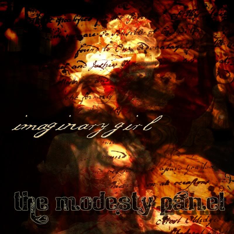
|
|
| Author: | Snaxocaster [ Sun Dec 08, 2013 2:28 am ] |
| Post subject: | Re: Solorekkid Idea Crappe. |
This is better: 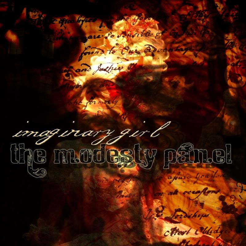 This is a more rawkin' tune, demanding of a more rawkin' cover aesthetic: 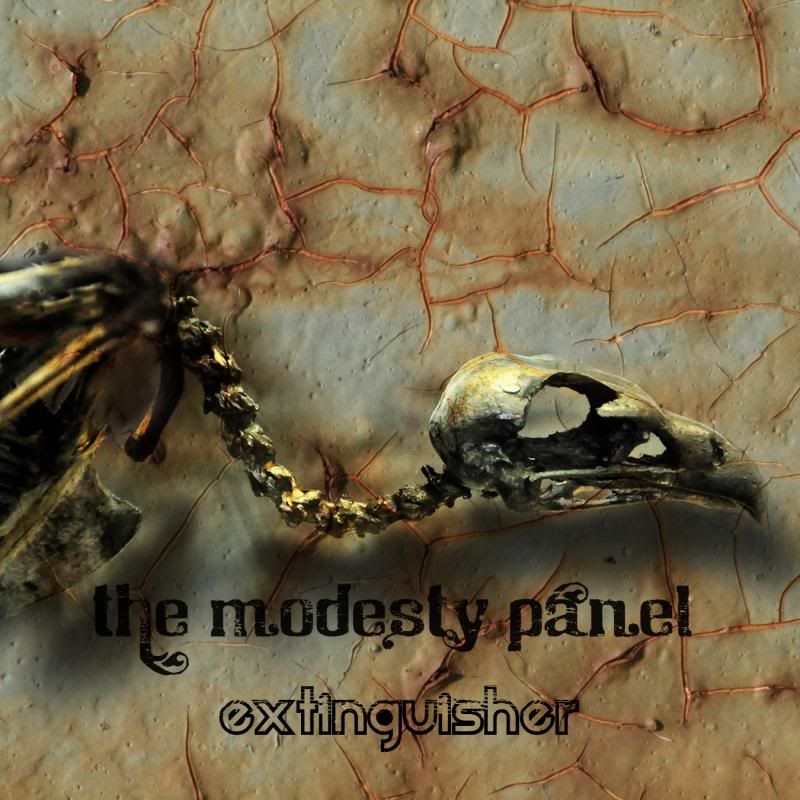
|
|
| Author: | chris_d [ Sun Dec 08, 2013 10:20 am ] |
| Post subject: | Re: Solorekkid Idea Crappe. |
Obviously, nice stuff.  I think your own handwriting might look better for Imaginary Girl, if you had a scanner and whatever the kids use in place of adobe streamline these days. Or perhaps just play with the font you have, drop the 'g' s (and the 'y' )in line a bit, and in general the kerning seems off/overwide(or just inconsistent), making the typeface look a bit less swirly and a bit more 'free font from the internet'. I also kind of feel that the kerning on the album title could get tighter. That is more a personal thing of mine though, i like handwriting fonts to look a bit more handwritten. Udderwise, i like the colors and layers. What is the text underneath most of it from? |
|
| Author: | Snaxocaster [ Sun Dec 08, 2013 8:07 pm ] |
| Post subject: | Re: Solorekkid Idea Crappe. |
Hrmm... I could always ghetto-scan it with a camera. I'm sure I have a black sharpie kicking about that'll work well enough as source material for handwritten bits. My actual handwriting is sorta suited to this type of thing, now that you mention it. I get what yer on about re: kerning. I have a good collection of fonts that I went through for this and I should really make note of what they were, for consistency's sake. The one for Imaginary Girl is, I think, Thomas Jefferson's handwriting.  The text underneath is a political document; it may be the Articles Of Confederation, actually. Also .
|
|
| Author: | chris_d [ Sun Dec 08, 2013 9:16 pm ] |
| Post subject: | Re: Solorekkid Idea Crappe. |
Yarr, for giggles you could also play with cutting a sharpie with an xacto, into a chisel tip for a bit of an olde calligraphic swagger feel. Somewhere around here i actually have all of my proper nibs and holders for old timey scrawling. I don't think i have any ink left though. In the olden days i used to love scanning shit and making proper vectors out of it to use. Streamline, as simple and single-minded a program as it was, was one of my all time favorites. In conjunction with Illustrator, the sky was the f'ing limit. For stuff for print, being able to make vectors out of freehanded whatever-the-fuck-i-wanted, was dope. Last i heard, they just stuffed the Streamline functionality into one of the more recent photoshops i think? I am still operating on an a now-ancient copy of CS2 for that tho. The newer ones seemed a bit too much, too much. Even CS2 is a bit behemoth, IMO, space-wise, for what i use it for these days. And i also had a few random handwriting fonts back in the day. Sam Houston was one of them, and i think also Pushkin, and a couple of random ones i don't now remember. Unfortunately not all of them had all of the letters represented, so one had to choose carefully on an application-by-application basis, which one might be made to work.
|
|
| Page 1 of 1 | All times are UTC - 5 hours [ DST ] |
| Powered by phpBB © 2000, 2002, 2005, 2007 phpBB Group http://www.phpbb.com/ |
|